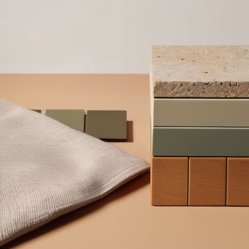
How to Pick the Perfect Color Palette for Any Space
I remember standing in the middle of my first studio apartment, surrounded by half-empty paint cans and a sense of pure paralysis. I had spent three weeks scrolling through Pinterest, convinced that if I didn’t find the “perfect” designer-approved palette, my entire life would feel disorganized and cheap. I was treating a simple design choice like a high-stakes exam, convinced that learning how to choose a color scheme required an expensive degree or a deep dive into complex color theory. In reality, I was just wasting time that I could have spent actually living in the space I was working so hard to build.
I’m not here to give you a lecture on the psychology of pigments or tell you to buy a hundred different swatches. Instead, I want to give you a functional system that gets you from “decision fatigue” to a cohesive room in under an hour. We’re going to focus on a few repeatable rules that strip away the guesswork and the unnecessary spending. My goal is to help you pick a palette that feels intentional and looks high-end, without letting the process drain your energy or your bank account.
Table of Contents
Mastering Color Theory for Interior Design on Autopilot
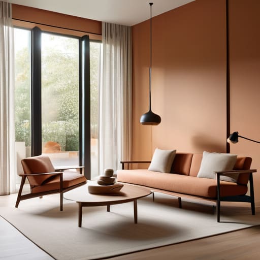
Look, you don’t need a degree in fine arts to get this right. Most people get paralyzed by the sheer amount of options, but mastering color theory for interior design is actually just about setting boundaries. Instead of trying to pick every shade manually, I use a simple ratio: 60% dominant color, 30% secondary, and 10% accent. This keeps you from accidentally turning your studio into a chaotic patchwork quilt. If you want to play it safe but still look intentional, lean into neutral color palettes for living rooms as your 60% base. It gives you a clean slate that won’t make your eyes ache after a long workday.
Once you have that foundation, stop guessing about what “goes” together. If you want energy, look for complementary color combinations—think opposites on the wheel like a deep navy paired with a muted ochre. If you want your space to feel like a sanctuary, stick to a single temperature. Choosing between warm vs cool color schemes is the fastest way to dictate the vibe; warm tones feel cozy and lived-in, while cool tones feel crisp and organized. Pick a direction, set your ratios, and move on.
Using the Psychology of Color in Rooms to Work for You
The psychology of color in rooms isn’t about following a textbook; it’s about how a space makes you feel when you walk through the door after a long day. If you’re working from a cramped corner of your studio, you don’t want high-energy reds or oranges screaming at you while you’re trying to focus. You want something that settles your brain. I usually lean toward cool tones—blues or muted greens—for workspaces because they tend to lower the heart rate and help with clarity.
On the flip side, if you’re trying to make a small, dim living area feel less like a cave, don’t feel forced into bright, obnoxious colors. You can actually use warm vs cool color schemes to manipulate how much space you think you have. Warm tones can make a large, echoing room feel more intimate and grounded, while lighter, cooler shades can trick the eye into thinking the walls are further away. The goal isn’t to create a museum; it’s to pick a vibe that supports your actual daily routine without requiring a mental overhaul every time you enter the room.
Five ways to pick a palette without losing your mind
- Use the 60-30-10 rule to stop guessing. 60% is your dominant neutral, 30% is your secondary color, and 10% is your “accent” for things like pillows or a single lamp. It prevents that cluttered, “I bought everything in this aisle” look.
- Limit yourself to three core colors. I see people try to juggle five or six different shades and end up with a room that feels chaotic instead of cohesive. Pick three, stick to them, and move on with your day.
- Test your colors in your actual light, not on a screen. A “calm grey” in a bright showroom can look like a depressing concrete slab in a north-facing apartment. Grab a few cheap samples and see how they look at 8 PM under your actual lamps.
- Pull colors from things you already own. If you have a rug you actually like or a piece of art that isn’t an eyesore, use those as your foundation. It’s the easiest way to ensure the room feels intentional rather than just a collection of random stuff.
- When in doubt, lean on high-contrast neutrals. If you’re paralyzed by choice, just go with cream, charcoal, and one wood tone. It’s a system that works every single time and requires zero mental energy to maintain.
Stop overthinking it and just start
At the end of the day, choosing a color scheme shouldn’t be another exhausting project on your to-do list. We’ve covered the basics: use a simple palette to avoid visual clutter, leverage color psychology to set the right mood for your specific rooms, and stop trying to follow every fleeting trend you see on social media. The goal isn’t to create a showroom that looks perfect in a filtered photo; it’s to build a functional environment that supports how you actually live. If you’ve picked three colors that play nice together and they don’t make you feel stressed when you walk through the door, you’ve already won.
Don’t let the fear of making a “wrong” choice keep you paralyzed in a room that feels stagnant. You can always repaint a wall or swap out a cushion, but you can’t get back the time you spent staring at swatches instead of actually enjoying your space. Your home is a living system, not a museum piece. Build a foundation that works for your budget and your lifestyle, then let it breathe. Get the paint on the walls, get your life in order, and stop treating interior design like a high-stakes exam. You’ve got this.
Frequently Asked Questions
How do I pick colors that won't make my small apartment feel even more cramped?
Stop trying to paint everything stark white; it just makes a small space look clinical and cold. Instead, stick to a monochromatic or low-contrast palette. Pick one base neutral—think soft greys, warm sands, or muted sages—and use varying shades of that same tone throughout the room. It tricks the eye into seeing continuous space rather than chopped-up sections. Keep the heavy, dark colors for small accents, not the walls.
Is it worth buying expensive paint samples, or is there a faster way to see if a color actually works?
Don’t drop $50 on a dozen tiny sample pots. It’s a money pit and a mess to clean up. Instead, grab a few high-quality peel-and-stick samples if you can swing it, or just use a large piece of white poster board. Paint your color on that and move it around the room at different times of the day. It lets you see how the light actually hits the pigment without committing to a single drop of wall.
How do I balance a color scheme if I already have furniture or rugs that don't match my new palette?
Don’t toss a perfectly good rug just because it doesn’t “match.” That’s a waste of money and effort. Instead, use the 60-30-10 rule to bridge the gap. If your rug is a loud navy, pick a neutral (like oatmeal or grey) for 60% of the room, a secondary tone for 30%, and use small accents—pillows, a vase, or a throw—to pull that navy through the rest of the space. It’s about connection, not perfection.